How To Make Simple CSS Changes To Your Theme Without A Child Theme
Sometimes you want to edit the look of your theme, but the changes are so small that you don’t even want to bother with a child theme.
Or maybe you’re new to working with the inner workings of WordPress, and don’t want to mess about with Child Themes just yet, but you know your CSS.
Either way, there is a fairly simple solution to your problem: Use a custom CSS plugin. By using a custom CSS plugin, you can basically override any lines of code that you want to, and change the look of your code instantly without having to deal with a child theme.
Step 1. Install a Custom CSS Plugin
So the first thing you need to do, is install a custom CSS Plugin. I like to use the ‘Simple Custom CSS’ plugin, or the custom css functionality that is included in Jetpack.
Step 2. Identify The CSS You Want To Change
The second step here, is to identify exactly which code you want to change or override. It’s important to get the ID or Class just right, otherwise the rest of the code you write won’t matter at all.
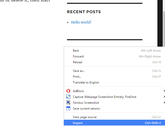
Open up your site in a new browser window. If you’re using chrome, all you need to do is right click somewhere, or highlight something in the appropriate section and then right click, then select ‘Inspect’.
(If you are using FireFox, you can use an add-on called Firebug which will give you similar, if not superior inspection tools.)
For example, if you want to edit things in your sidebar, simply hover over it, right click, and click inspect like this:
That brings up the inspection tool, and right for the relevant code that goes into styling what you hovered. In this case, the mouse was hovering the Widget Title, so when inspected, it takes us directly to the styles and html for the widget title.
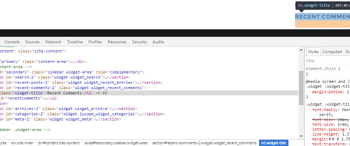
If you’re already used to working with CSS, you might know exactly what you are looking for. If you’re a beginner, take second to make yourself familiar.
On the left, you see the different html tags and text that outputs the content of the site. On the right, you see CSS that styles this content, often multiple instances of it.
If we want to focus on editing the title of the widget areas, make sure that in the HTML section you are selecting the HTML line that looks something like this:
<h2 class="widget-title">Archives</h2>
The actual name of the class depends on the theme you are using, but themes from the WP.org repository, follow certain standards for naming classes.
Then look closely at how it’s styled. In Twenty Sixteen, it’s styled like this:
.widget .widget-title {

font-family: Montserrat, "Helvetica Neue", sans-serif;

font-size: 16px;

font-size: 1rem;

letter-spacing: 0.046875em;

line-height: 1.3125;

margin: 0 0 1.75em;

text-transform: uppercase;
If you want to style something else in the widget area, simply look until you find the appropriate section of code, then select it.
For example, if we select the widget section instead of the heading, we now see the styles for that section.
Step 3. Override The CSS By Writing It Into The Plugin
Now it’s time to get time to business and override the CSS, but before that…
Get Familiar Media Queries Before Going Further
Most WordPress themes these days, use media queries in CSS to help make the theme more responsive and mobile-friendly.
They are the lines of code in the css that start with @media. If we look at one of the breakpoints from the Twenty Sixteen theme as an example, it looks like this:
@media screen and (min-width: 61.5625em)
If you don’t know how media queries work and you try to override CSS in your theme, you can completely break how the site looks on multiple devices. (Sometimes even all.)
Media Queries, are typically used to set pixel or EM breakpoints for screenwidth, letting you change the styling of the site for each of these breakpoints.
They are thankfully quite straightforward to work with in most themes. Usually they set multiple media queries for different minimum widths(look at example above).
This means all you have to do is make sure you put the lines of code for styling your site at different screen sizes.
You can read more about media queries here.
Now that you know a bit about media quieries, you are much better equipped to tackle most up-to-date WordPress themes.
To override a certain style, simply copy the original css code into your Custom CSS plugin of choice.
.widget .widget-title {

font-family: Montserrat, "Helvetica Neue", sans-serif;

font-size: 16px;

font-size: 1rem;

letter-spacing: 0.046875em;

line-height: 1.3125;

margin: 0 0 1.75em;

text-transform: uppercase;
And now all we need to do is make the changes that we want. Delete the lines that you don’t want to overrule, but if you want to set margins or other things to 0, deleting the lines of code does not work.
The way the plugin works is that the css from the plugin is called last, and then overrules the original CSS. So if you delete the line, then nothing gets found from the plugin, and the browser will be sent the line from the theme, uninterrupted, making it look exactly the same as before the attempted change.
If you just want to remove letter spacing and margins from the above code, it looks like this:
.widget .widget-title {

letter-spacing: 0;

margin: 0 0 0;

}
Step 4. Confirm That It’s Working
How you’re going to confirm that your changes are in effect, depends on where you decided to put your changes.
If you changed only the styling on a mobile sized screen, you’ll want to check on a mobile, and also all other screen sizes.
If you changed the styles for everything, you should check as broadly as you can.
(Step 5. Troubleshoot If It’s Not Working)
Does your CSS work correctly? If not it’s time to troubleshoot.
Did you do your media queries correctly?
Messing up a media query can mean that none of your changes show up as you intended. For example, if you accidentally set max-width instead of min-width, or vice versa, you’re not going to have a very good time.
An easy way to troubleshoot, is checking if the styles you wanted to apply at a certain with, appear on other widths. If you did this using a basic min-width, or max-width query, you can check by just resizing your browser window, and seeing what changes.
For example, if one of my queries is accidentally max-width, it can overrule all my styles for other widths, breakpoints with a width above that width.
(You can read more about them in the media querie section above.)
Is Your CSS Specific Enough?
CSS specificity basically refers to prequalifying areas that you want to style. It basically works by giving conditions for things that need to be in place before the style should be applied.
For example, if you write:
aside h2 {
This will only target H2s in the aside, and will style those. Any H2s on the rest of the page will be left alone.
If you write:
.site-main article h2
This will only affect H2s inside of articles, inside of a .site-main class element.
WordPress themes typically make use of CSS specificity a fair bit. This means that when you want to make simple CSS changes, you need to pay close attention to how specificially the original CSS is styling the section you want to style. Then copy that level of specificity, and add another level.
Let’s say the original snippet of code targets the appropriate elements like this:
.site-main article
If you only want to target a certain page, you can use a page-id:
.page-id-19 .site-main article
(This only works if the theme uses the body_class() function)
If you want to target pages with a certain template, you can use the page template:
.page-template-page-blabla .site-main article
If you just want to overrule in general, you can add another generic element into it for more specificity, like body:
body .site-main article
These are just some ideas for what might be wrong with your CSS. You can read more about CSS troubleshooting in the codex, here.
Conclusion
You don’t need to work with child themes to overrule the CSS of your website. If you want to make a few simple changes(or if you want to override styles from a plugin), a custom CSS plugin is a great tool.
If you are making a lot of small changes, or a few really big ones, it takes a long time to learn how to make the changes the right way. So learning how to work with a child theme, will make sense.
It will also be the better choice or complex changes. And it’s actually very simple, as well. You can read more about how to actually work with them here.
Purchasing cheap custom term papers may be a viable option for students dealing with time constraints or struggling with writing. While affordability is appealing, ensuring purchase cheap custom term papers may be strong for students facing time constraints or writing difficulties quality and authenticity is paramount. It’s crucial to research thoroughly and choose reputable services to avoid compromising academic integrity.
Academic essay help can be invaluable. For detailed instructions, refer to this guide. Writing content creation involves crafting well-structured, insightful, and engaging essays that clearly convey your understanding and analysis.